Perfectly Contrasting Text on a Gradient Background
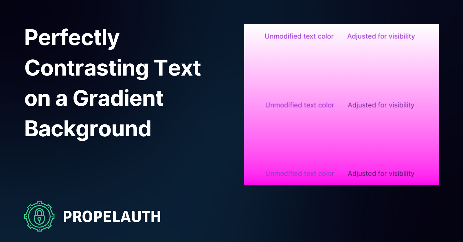
Gradient backgrounds are one of the more popular current web design trends, and I must admit they can look very pretty. What doesn’t look so nice is poorly contrasted text rendered directly on top of one.
This is trickier to avoid than you’d think, especially when you want to render text elements using a specific shade (think links with your primary brand color). Sure, you can look at a piece of text and say “Gee, this needs to be darker to be visible on that background”, but resizing the page or viewing it on mobile may position said text in a completely different area where it’s poorly contrasted.
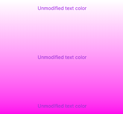
The text at the top is perfectly legible, but it gets harder and harder to read as we move down on the Y axis. There are some colors that will contrast well against all shades of this gradient (i.e. black), but being sandboxed like this is often not an option when it comes to elegant product design.
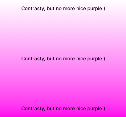
Contrast can be unintuitive
I ran into this issue while tackling some pretty niche design challenges, but the solutions I came up with are widely applicable. One of PropelAuth’s main product offerings are login/signup/etc. pages that you theme and we host. All you really need to do is set a primary brand color, pick a light or dark background, and you’re off to the races. We’ll then style your login pages using that color for certain elements like buttons and links.
Unfortunately, it’s not as simple as setting color: $primary in a Sass file and calling it a day. Just because a certain color provides sufficient contrast between a button and a background, it doesn’t necessarily mean that it will do the same for text.

Believe it or not, that text is the exact same color as the button. Of course, if you have complete control over your website, you can just pick a darker or lighter text color to increase contrast. That isn’t an option when you’re dynamically theming a website using someone else’s color scheme, or when rendering text directly against gradient background, so we need to get a little creative here.
Getting good-enough contrast
The simplest possible solution is to lighten or darken your text color until it reaches the WCAG 2.0 recommended contrast threshold of 4.5/1. Contrast ratio is easy to calculate on the fly; you compare the relative luminance values of two colors by dividing the larger against the smaller, and you’ve got the resultant contrast value (which will be somewhere between 21 and 1). If you don’t want to write the luminance & contrast code yourself, you can do what I did and use the tinycolor2 library instead.
import tinycolor from "tinycolor2";

const makeColorReadable = (color: string, background: string): string => {
	const c = tinycolor(color);
	const bg = tinycolor(background);
	const isBackgroundDarker =
		bg.getLuminance() < c.getLuminance();

	while (
		// tinycolor.readability() returns the contrast ratio of two colors
		tinycolor.readability(bg, c) < 4.5 &&
		c.getLuminance() >= 0 &&
		c.getLuminance() <= 1
	) {
		if (isBackgroundDarker) {
			c.lighten(1);
		} else {
			c.darken(1);
		}
	}

	return c.toHexString();
};
By applying this code to the pale purple primary color of the button from our earlier example, we can darken the shade into something that contrasts perfectly with the background while still matching the brand theme.

As discussed at the beginning of this post, this is only viable for a solid background, but the same logic applies to a simple solution for a gradient background. To get decent contrast on a gradient background without straying too far from your primary color, simply average the gradient background out and use this new, single color to perform your contrast calculations. Again, tinycolor2 comes in very handy here:
const averageGradientColor = tinycolor
		.mix(gradientColor1, gradientColor2, 50)
		.toHexString();
const newTextColor = makeColorReadable(primaryColor, averageGradientColor);
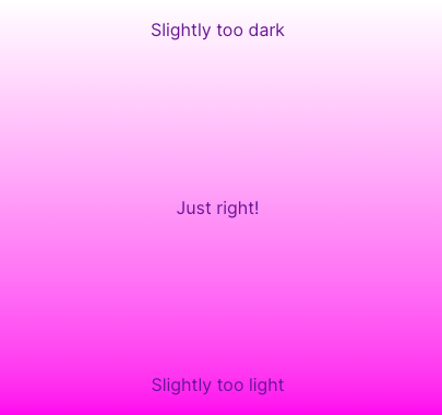
The results are pretty good, but not perfect. The text color is optimized for the center of the gradient, so there’s a bit of a Goldilocks thing going on:
Go a step further for pixel-perfect contrast
If we want truly perfect contrast for the text, agnostic of where it is on the page, we need to extend that dynamic contrast logic a bit. Rather than only calculating a single contrasting color, we can calculate one for each color that composed the background gradient. For our classic pink and purple example, that contrasting gradient would look like this:

From here, all we need to do is layer the contrast gradient on top of the original one and then use a text clipping mask and transparent text to effectively color the text with that gradient:
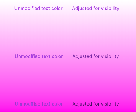
Voila! Perfectly contrasted text, no matter where we are on the page. The only vaguely tricky part of this technique is using multiple overlapping backgrounds, but a little position: absolute magic solves this nicely.
.pink-background {
	position: absolute;
	top: 0;
	right: 0;
	bottom: 0;
	left: 0;
	background-position: center;
	background-size: cover;
	background-image: linear-gradient(180deg, white, pink);
}

.contrast-background {
	height: 100%;
	width: 100%;
	background-position: center;

	/* color1 & color2 are the contrasting colors */
	/* calculated against white and pink */
	background-image: linear-gradient(180deg, $color1, $color2);
	background-size: cover;
	background-clip: text;
}

.contrast-text {
	color: transparent;
}
<div>
	<div class="pink-background" />
	<div class="contrast-background">
		<p class="contrast-text">
			This text will be perfectly contrasted!
		</p>
	</div>
</div>
Summary
Achieving perfect contrast between text and a gradient background in web design is tough. However, by dynamically adjusting text color based on the WCAG 2.0 recommended contrast threshold, and using libraries like tinycolor2, it is possible to ensure legibility. For gradient backgrounds, the average color of the gradient can be used for contrast calculations. For pixel-perfect contrast, a contrasting gradient can be calculated and layered on top of the original one, with the text color effectively being the gradient.